UX Studio Challenge
In 2023 I applied for a UX Designer job at UX Studio in Budapest. They sent me their test assignment which they called UX Studio Challenge.
This Case Study is about my journey to complete the challenge.

“As an elderly person (over 60), I would like to meet people with similar interests and find friends.”
01
01 - PROBLEM
THE TASK
My task was to create an example project based on one of this problem statements above while completing the following criteria:
-
Briefly explore the chosen topic.
-
Create one clear and consistent wireframe flow that solves the problem.
-
Create two high-fidelity UI screens based on the implemented wireframes.

-
Research
-
Personas
-
Site mapping
-
Wireframing
-
High fidelity UI Design
02
02 - DESIGN METHODS
The first thing I wanted to clarify is whether this product should be a website or a mobile application.
In this 2022 study (https://www.ncbi.nlm.nih.gov/pmc/articles/PMC9118453/) they revealed that among in and outpatients who are above the age of 65, only half of them are computer users. Compared to the younger generations this seems low, but if we take into account that the number of tech users is growing significantly among elderly people (https://www.pewresearch.org/fact-tank/2022/01/13/share-of-those-65-and-older-who-are-tech-users-has-grown-in-the-past-decade/) making a digital product for them might seem a really good idea. Not to mention that this would help them be more active, find new people, help to keep their mental health, and have more reasons to go out and get up from bed (https://www.ncbi.nlm.nih.gov/pmc/articles/PMC5312603/ ).
I would be happy to see a great product like this on the market.
03
03 - RESEARCH
DEVICES
Now the question is, which device would be the best fit for a senior person? I’ve found out the best solution is a tablet for them (https://www.grayingwithgrace.com/laptop-or-tablet-best-for-seniors/).
While laptops have larger screens, are portable, and can be used for so many things, they are also heavy and tend to be more complicated than they should be for people above 65.
Smartphones, on the other hand, are small, and easy to access and use but it can be difficult for seniors when it comes to typing, filling out pages, and writing down something. Because of the smaller screen, the keyboard cannot be comfortably big for them.
When it comes to tablets, it combines the benefits of the two other device types: they have big enough screens, are portable, light, have thumb-sized buttons on the screen keyboard and it’s easy to fill out forms when you are creating profiles for example. However, this might be the best solution for elderly people, who are tech users and still have computers and often use them as well.
COLOR AND VISION
It is commonly known, that older people see colors a bit differently and they have at a higher risk of getting cataracts, that affect their way of seeing things (https://www.webmd.com/healthy-aging/news/20140318/color-vision-tends-to-fade-with-age-study)
As this article says (https://healthfully.com/colors-elderly-8551183.html):
„As people age, their eyes also change. The lens and cornea begin to yellow and darken, and the pupils shrink in size. The aging eye also changes to have a high degree of light scatter as cataracts form, and the field of vision becomes limited. For this reason, the colors that are chosen for the elderly should remove any yellowing and brightness since the eyes of a 60-year-old can only filter a third of someone age 20."
Senior people see colors muted and in most cases, it’s hard for them to distinguish yellow from green and blue from purple. Pastel colors are also not the best option for them.
COMPETITORS ON THE MARKET
Unfortunately, there are not many competitors on the market now, but I'd like to believe that this will change in the next couple of years. I’ve found a website (https://amintro.com/) that has a similar goal to what we have, but the site and its functions are very limited. It only focuses on finding new people and chatting with them.
Also, this app (https://play.google.com/store/apps/details?id=com.aarp.app&hl=en_US&gl=US) is recommended for senior people to find events and programs locally or across the country, but the user interface is not built for them: it has small texts that are hard to read and crowded screens that are hard to navigate when you are older and not an advanced technology user.
SUMMARY
I would suggest to:
-
go with a responsive website, that can be accessible from all devices.
-
Regarding color, I would like to go with bright, vivid, and cheerful colors, that are easy to distinguish, also use bigger buttons and text fields on a not-too-crowded screen.
-
Because of the type of this assignment, I will only make a design solution for desktop screens.
-
These studies are focusing on US citizens, so for this task, I choose to make this product for the US market.
Based on the research, I was able to make 4 User Personas. Together they represent the majority of the target audience
04
04 - PERSONAS


I created two site maps: one for the visitor (who is not logged in) and one for the member (who is already signed in) For the latter extended functions are available.
05
05 - SITE MAPS

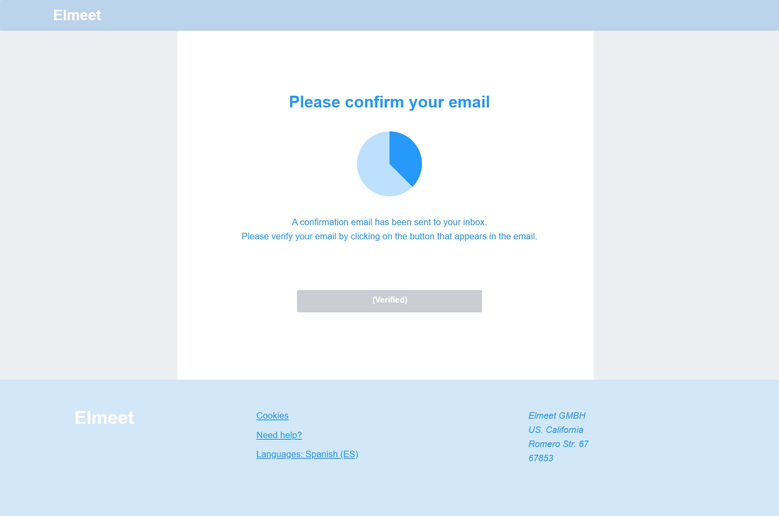
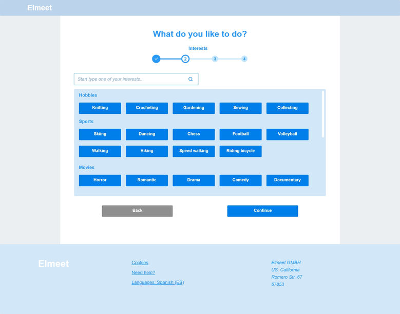
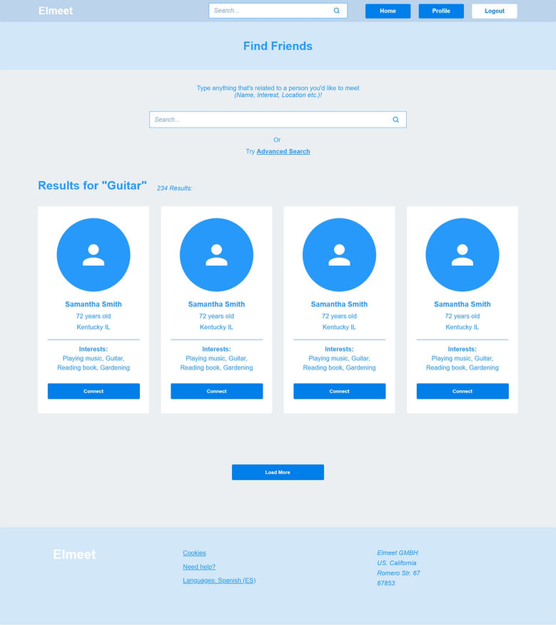
For this task, I decided not to go with sketched wireframes (although I’m the most comfortable drawing with my hands 😊) but rather to make them in Adobe XD.
I also connected the screens so it became a lo-fi prototype.
06
06 - WIREFRAMING
I chose the news feed and the profile pages to make a high-fidelity UI Design for them.
Many people have trouble seeing, reading small texts, or differentiating colors, so I made some design decisions based on what I’ve learned about the target audience. I made the buttons big enough to read, but not that much to look huge. I didn’t base everything on icons when it comes to buttons, I also (or only) used texts, so we can minimize mis-clicks too.
I used vivid colors so that users who cannot differentiate colors easily, can find the separate functions on the website.
For the registration process, I divided the filling form into steps, so it’s easier to digest and fill out everything necessary without getting frustrated.
07
07 - RESULT


It was a challenging task because I wanted to do it properly and show what I learned so far. People usually don’t spend days on test assignments, but I love UX Studio, and I wanted to show them my skill set. Unfortunately, I didn’t have enough time to finish the two high-fidelity screens, they had some errors in them, so eventually I didn’t get the job.
But hey, at least I could learn from this task!


